Process
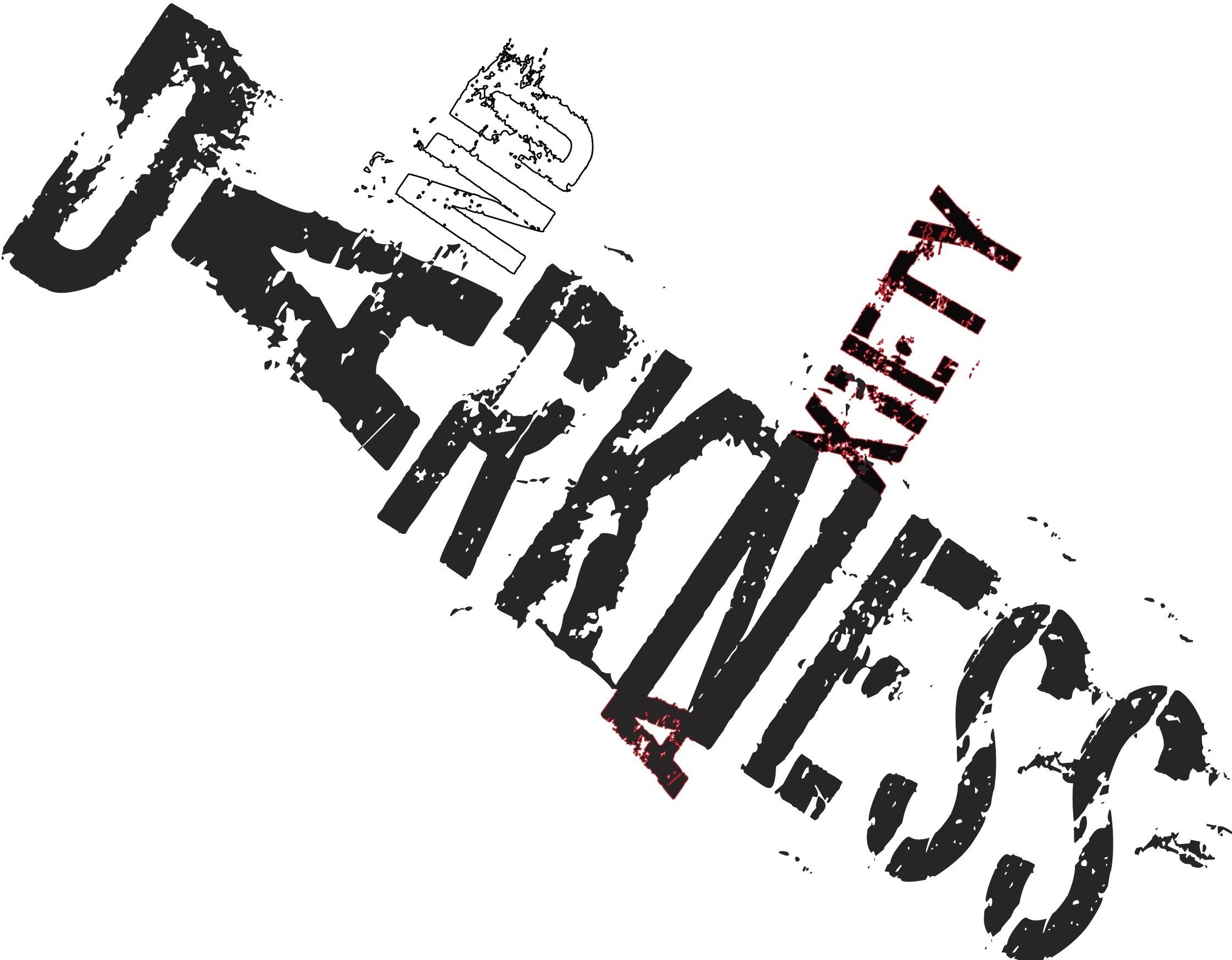
When listening to heavy metal music, you will often hear very dark lyrics. The music from bands like "Bullet for my Valentine" to "Motionless in White" tends to use their music to amplify the practical problems that band members overcame. Ranging from depression to suicidal thoughts, they talk about being in a dark place and having to crawl their way out before it consumes them. I took the words darkness and anxiety directly from the song, Monomania from the band The Word Alive. I wanted to take these words and create a logotype that captured metal's essence.
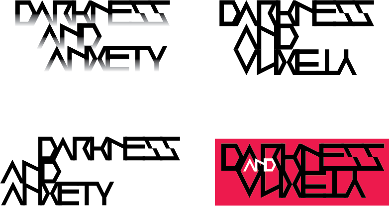
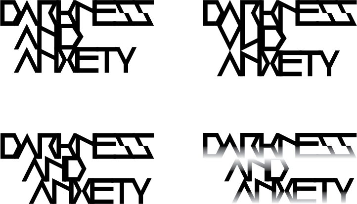
Choosing the font
After looking through different fonts, I finally found a techno font called Anxiety. After exploring several different hierarchies and multiple font directions, I was able to create multiple variations of the logo, which you can see below.
Final Choice
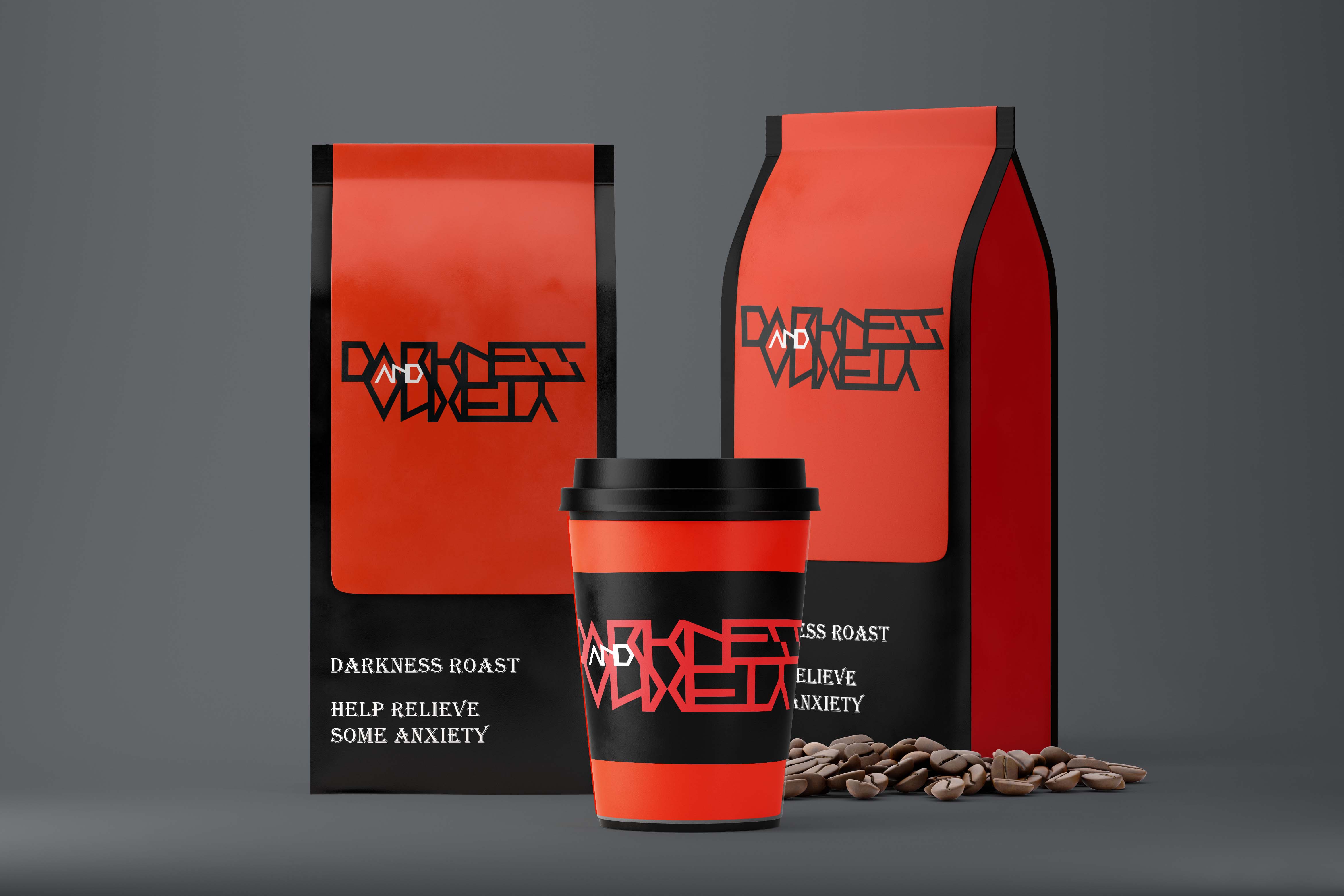
I decided to go with the variation that incorporated the color red, since metal bands use dark vibrant colors to amplify the meaning behind their songs. While I felt the variation with the color red popped out more, the problem that arose was separating the logotype from the color. My final logotype needed to show it can be effective with or without the color red.
Picking the mockup
When I hear darkness and anxiety out loud, I automatically think of metal music so picking a mockup that represents metal's aggressive nature becomes pretty narrow. I can't just slap this logotype on a box of cookies because people will be scared just by the name. Narrowing it down to coffee became easy since coffee brands aren't tethered to expectations towards a certain audience, the sandbox is so vast it allowed me to explore a darker tone. I also played around with the branding of the coffee to deliver a brand that capture's heavy metal's attitude.